Advertiser Disclosure: Eye of the Flyer, a division of Chatterbox Entertainment, Inc., is part of an affiliate sales network and and may earn compensation when a customer clicks on a link, when an application is approved, or when an account is opened. This relationship may impact how and where links appear on this site. This site does not include all financial companies or all available financial offers. Opinions, reviews, analyses & recommendations are the author’s alone, and have not been reviewed, endorsed, or approved by any of these entities. Some links on this page are affiliate or referral links. We may receive a commission or referral bonus for purchases or successful applications made during shopping sessions or signups initiated from clicking those links. The content on this page is accurate as of the posting date; however, some of the offers mentioned may have expired.
Well I am proud to show off the new face of DeltaPoints.com. We have a logo that is all our own. We used a kool concept at 99designs.com to get the job done. Basically designers all over the world compete to make a logo for you and the winner gets the fee! I loved the process.
So, we still have a 747 but like I always say, look up, you will see me on a Delta jet! It works with my theme.
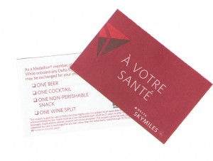
There were many designs that did NOT make the cut. I am most happy with the results. Tell me what you think. Did I pick the best one or do you like another one. Neither answer will improve your chance to win a set of 2 drink coupons tonight! – René
▲Delta▲ SkyMiles® Credit Card
American Express – RESERVE/PLATINUM/GOLD
Click here for more information
Advertiser Disclosure: Eye of the Flyer, a division of Chatterbox Entertainment, Inc., is part of an affiliate sales network and and may earn compensation when a customer clicks on a link, when an application is approved, or when an account is opened. This relationship may impact how and where links appear on this site. This site does not include all financial companies or all available financial offers. Opinions, reviews, analyses & recommendations are the author’s alone, and have not been reviewed, endorsed, or approved by any of these entities. Some links on this page are affiliate or referral links. We may receive a commission or referral bonus for purchases or successful applications made during shopping sessions or signups initiated from clicking those links.


Like it!
Don’t care for it.
Like it!
Like it and the process is very intriguing!
like the new logo.
I like it!
Very nice. It is the one I would have picked. I’m also a sucker for free booze! D)
Good choice!
Like it, but prefer #79.
@ David – I liked that one and the one that looks like a runway. But I think this once captures the direction I wanted to go. It was hard but so fun! – Rene
i like it
like it
I like it. It looks sophisticated!
you are becoming a leading blog
@Rick – wow – wow – txs from the king of blogs – Rene
Looks good to me!
Me likey.
I’d have to go with the one you picked or #67.
Very very nice
like it.
I like it…digging the plane!
I like it
Kind of cool
I like it.
I like it, and that is an awesome concept from 99designs.
Not really into it either.
i like it, but i also like #79
also, i have never heard of this site and think its cool! (this = 99designs)
Very nice!
Good choice – looks great!
good choice
some nice choices in the mix.
Very swanky, I like it.
Super job
Looks like all of the designs were taken down but like the one you chose.
@ TT – I was the one who chose what I wanted and what I did not. That way the artist could understand what I was looking for. So the ones I did not like I said not of my taste! – Rene
I like it!!
And – I used 99 Designs for my logo redesign about a year ago – and loved the process, too!! It’s great to get so many designs, and actively have the process evolve from start to finish.
Love it!
Excellent choice!!
looks great!
Nice!
I love it!
Looks good.
Like it!
i think you picked a winner
Very sharp.
I also like it, but I like #79 better (like a few others). Why? The “triangle” you have chosen is wavey and cut up, whereas the triangle in #79 gives the impression of both solidity and movement. Just my impression.
This one seems best from the remaining choices.
You picked the right one.
like it a lot
like!
Nice logo
It’s okay
Like it better than the old one.
Looks pretty good
Like it!
Kewl!
Looks great! Like it! Very professional!