Advertiser Disclosure: Eye of the Flyer, a division of Chatterbox Entertainment, Inc., is part of an affiliate sales network and and may earn compensation when a customer clicks on a link, when an application is approved, or when an account is opened. This relationship may impact how and where links appear on this site. This site does not include all financial companies or all available financial offers. Opinions, reviews, analyses & recommendations are the author’s alone, and have not been reviewed, endorsed, or approved by any of these entities. Some links on this page are affiliate or referral links. We may receive a commission or referral bonus for purchases or successful applications made during shopping sessions or signups initiated from clicking those links. The content on this page is accurate as of the posting date; however, some of the offers mentioned may have expired.
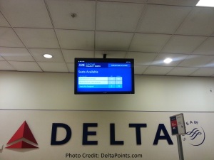
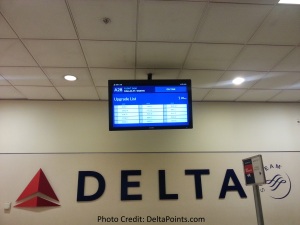
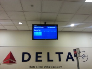
Coming off a redeye this morning from San Francisco I though my eyes were playing tricks on me. I looked up and said to the gate agent, “Oh they have updated the GIDS” or Gate Information Display Screens.
He then looked up and did a double-take and was surprised to see the new graphics as well. We have seen lots of updates over the past year to Delta.com HERE and HERE.
I really like this new one to match the MAC-ish look Delta is going for (especially the part where I am on the cleared list for upgrade). It seems much crisper and simpler to read. What do you think of the new look? – René
UPDATE: I just got this from my Delta REP today:
- 1,270 GIDS are located at airports throughout the Delta system.
- 34 airport locations are equipped with GIDS in gate hold areas.
- 90 – Average number of seconds that it takes for one complete cycle of information during boarding, with 1 standby list screen, 1 upgrade list screen and 2 pages of cleared list displays.
.
.
Gold Delta SkyMiles®
Credit Card from American Express®
Click HERE for more info
Advertiser Disclosure: Eye of the Flyer, a division of Chatterbox Entertainment, Inc., is part of an affiliate sales network and and may earn compensation when a customer clicks on a link, when an application is approved, or when an account is opened. This relationship may impact how and where links appear on this site. This site does not include all financial companies or all available financial offers. Opinions, reviews, analyses & recommendations are the author’s alone, and have not been reviewed, endorsed, or approved by any of these entities. Some links on this page are affiliate or referral links. We may receive a commission or referral bonus for purchases or successful applications made during shopping sessions or signups initiated from clicking those links.


Looks very much like United’s stuff. Strangely enough, i look forward to seeing the other screens tomorrow when i fly to MCO for a lunch meeting.
They are using the money saved from cutting stopovers to upgrade the GIDS? 😀
@Ed – GRRRRRRRRRR 😉
Crisper, easier to read and more consistent with the visual theme of the new advertising such as in the jet bridges.
Cleared list is always easier to read when you’re name is on it. It’s when it’s missing that you have to reread it about 18 times to be sure you read it correctly.
Looks like less content per page though. Gonna be an even longer scrolling upgrade list now at DTW. So what I first noticed though is the there seems to be way less pandering for purchasing upgrades on the new GID screens. Is that correct? or just didn’t catch those slides?
@Ed C stopover money is feeding the new seat covers IMO, must be the open jaw dyke plug that funding these GIDS upgrades 😉