Advertiser Disclosure: Eye of the Flyer, a division of Chatterbox Entertainment, Inc., is part of an affiliate sales network and and may earn compensation when a customer clicks on a link, when an application is approved, or when an account is opened. This relationship may impact how and where links appear on this site. This site does not include all financial companies or all available financial offers. Opinions, reviews, analyses & recommendations are the author’s alone, and have not been reviewed, endorsed, or approved by any of these entities. Some links on this page are affiliate or referral links. We may receive a commission or referral bonus for purchases or successful applications made during shopping sessions or signups initiated from clicking those links. The content on this page is accurate as of the posting date; however, some of the offers mentioned may have expired.
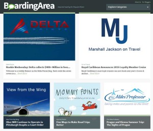
Well you have now had some time to look at the new BoardingArea home page. What do you think? Do you like it? Are there some good things and bad? Are there things that look better on mobile devices now compared to the way they were before under the old classic theme? Do you miss some things or are you happy with the new format? Tell me what you think in the comments below on the blog and vote in the reader poll!
It will soon be time for DeltaPoints to change it’s theme. Before you say: “why? I like DeltaPoints the way it is!” I can tell you I do too. I am not one who likes change especially when DeltaPoints has grown every single month this year i.e. month over month growth. Why do we have to change when it is the content, not the look, that keeps bringing so many readers back and attracting new readers as well? Well it is really simple. Last month 30% of all viewers were on mobile devices. Yes, that means 70% are on desktops. However, the mobile access is growing and growing and will soon be 50-50. Next it will swing the other way. Mobile platforms are the future.
So DeltaPoints needs an adaptive theme for the future of the blog (now almost 3 years old). We have a bunch of choices. One way is an uber simple theme that I picked for the DeltaMileageRun blog. If you have never seen it go look HERE. It does look very much like the old theme of DeltaPoints. It is not perfect and I am still tweaking it as I have time. But it is really simple and works. But there are other choices that are fresh and yet not over the top different.
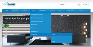
Here is a link to one of the themes I really really like and am strongly considering. I will tweak it a bunch too. I do NOT like multi-drop down boxes and do NOT plan to use them. I like click once and one choice as when on a tablet drop-downs can be a real pain (at least to me). Take a look and see if you like it. I am looking at the “light blue” style.
Other bits. I plan to keep the logo and the header as it is my trademark and is me. I don’t plan to have rotating “stuff” up top either. There really is so much that will need to be adjusted to feel right but it will be fun too.
Lastly, with almost 6,000 now subscribing via RSS & E-MAIL and some days ~10,000 views I don’t want the change to be “all about me”. I want you to feel at home here and to like what you see so I want your input. What do you think about all of this? Shout out and let me know! – René
.
Editorial Note: Any opinions, analyses, reviews or recommendations expressed in this article are those of the author’s alone, and have not been reviewed, approved or otherwise endorsed by any card issuer.
➲ Barclaycard Arrival+™
World MasterCard®
Earn 2x miles
on All Purchases
. .
Advertiser Disclosure: Eye of the Flyer, a division of Chatterbox Entertainment, Inc., is part of an affiliate sales network and and may earn compensation when a customer clicks on a link, when an application is approved, or when an account is opened. This relationship may impact how and where links appear on this site. This site does not include all financial companies or all available financial offers. Opinions, reviews, analyses & recommendations are the author’s alone, and have not been reviewed, endorsed, or approved by any of these entities. Some links on this page are affiliate or referral links. We may receive a commission or referral bonus for purchases or successful applications made during shopping sessions or signups initiated from clicking those links.


“Please choose a valid poll answer”
@AndyTLe – waiting for TECH to fix. For now poll at top right on the side bar does work! Txs
Unfortunately, NOT like thing the new layout at all. IMO the previous layout was much better. Just my $0.02 (and I generally DO NOT view via Mobile).
definitely the old look. what’s with every website copying Windows 8 and doing that whole flat “tiles” motif ? it’s a really inefficient use of space
It’s pretty hard on the eyes honestly.
@Heather – txs much & at all if you can include if you are talking mobile or desktop in your thought’s that would be sweet!
Honestly not impressed with the new boardingarea site. Expected better from Randy’s team!
For me, it’s really difficult to skim thru the content on the desktop. However, the mobile interface now looks more customized for the devices itself (previously, it would just open up the BA page and one would have to do a bit of left-right scrolling)
The old look was simple to read. The new look…not so much. In fact, I no longer have the site bookmarked. I have my favourite bloggers directly bookmarked but I feel I might miss out on discovering new ones.
I HATE the new Boardingarea website! It’s so chaotic and very difficult to tell which posts are from which bloggers. The posts are also not arranged in any logical way and have ads hidden in with them which makes it impossible to easily see which content you have already read. I used to make sure I’d read all the new posts for the day by looking at them chronologically on Boardingarea but because that’s now impossible, I only read the two or three blogs I like best. It’s a shame!
the new layout is horrible
The new boardingarea.com is a disaster.
Hate the new website. I find myself going here less. Hard to read
I was pretty upset at the new Boardingarea changes when they were rolled out and even after enough time to digest it, it still doesn’t look good. The mobile version IS better than before but why did they decide to hamper the desktop version for the sake of the mobile version? This is 2014, websites shouldn’t be sacrificing their design for different platforms.
I do not like the new format. Everything is in the center of the page. The initial loaded page has the top 1/3 with nothing of any value. Put your add on the left and right sides. Maybe over time you will fix this mess.
Really bad layout. bring the old one back. it is annoying to see how the moderators always find a way to (edit) the existing good things on the name of “change for better”. Just like Microsoft.
Gotta agree with the majority, the new version is very bad, difficult to read, don’t do the mobile version very often, and have not since the “enhancements”. Please go back to the old version, I loved being able to read the first few sentences of each new post to see if it was worth it (to me) to read the entire post. I too have booked marked my favorites and now only look at the new site 1x per day. I know that this will cause me to miss out, but I really do not like the3 new format. Sorry.
Also thanks for the poll. I’m glad that I am not alone in my feelings.
The poll is not working. I hate the new website, it is not to scale and has blank areas!
@Dale – yes you need to use the one top right on the sidebar.
I hate, HATE the new boarding area layout. However, I really like you DL Mileage layout.
@Paul – lol txs I can use that to for the new DeltaPoints as an option.
Sorry for the lack of specificity. I don’t like the Boarding Area desktop site. I don’t mind your desktop. Mobile is better for both but still not as good as the old.
Sorry to be negative, but I am very weary of all the scrolling required. The old layout had shorter boxes, so it was easier to see everything more quickly. I rarely scroll completely through it anymore.
I do like the snippets from each post, but perhaps that was there in the old version also?
Thanks for asking for our opinions!
I like that you can load more content at the bottom – so if you haven’t been to the site in a while, you can see what you might have missed. I don’t like that the logos don’t appear except for the top 3 blogs. It also doesn’t work for me in explorer – only in Firefox. All in all a mixed bag. I like one thing and really don’t like the other. If I had to choose, would probably go back to the old site.
I hate the new layout – it was much better with a simple listing of the bloggers.
old one
Definitely the old site was better than this one. Such an inefficient use of space, and the blurbs are shorter than before, making it harder to decide if I want to read an article.
The new mobile site is TERRIBLE for reading on an iPhone.
I can’t stand the new boarding area. sometimes I reduce the size of my browser and the images enlarge to the full page and I can’t see any story. There is way too much blank/white space and its hard to tell who the blogger is (aside from the first posts that exaggerate the blogger. Mobile is even worse. I can’t stand how much I need to scroll to look at the different stories. Plus no way to change to desktop view on mobile. The only positive thing is that I am more productive at work as I don’t spend that much time in boaring area anymore.
I can live with change but I hate the new boardingarea layout. It’s less easy to see everything at a glance. I find myself having to scroll and read more just to see what the headlines are. Please change it back guys.
This may not have to do with the layout per se, but it would be awesome if we could have threaded comments and the option for email updates for new posts in the comments section (beating a dead horse here I know but one can hope right :)).
@Gaurav – txs will look at that!
Did boardingarea just remove this article from their feed?
I could be wrong but I swear that where I saw the article but now I can’t find it. If they did they are hiding what most users want. The new layout is terrible.
The only good thing about the new layout is the loading of old stories. But I rather go back if that’s the only feature that improved.