Advertiser Disclosure: Eye of the Flyer, a division of Chatterbox Entertainment, Inc., is part of an affiliate sales network and and may earn compensation when a customer clicks on a link, when an application is approved, or when an account is opened. This relationship may impact how and where links appear on this site. This site does not include all financial companies or all available financial offers. Opinions, reviews, analyses & recommendations are the author’s alone, and have not been reviewed, endorsed, or approved by any of these entities. Some links on this page are affiliate or referral links. We may receive a commission or referral bonus for purchases or successful applications made during shopping sessions or signups initiated from clicking those links. The content on this page is accurate as of the posting date; however, some of the offers mentioned may have expired.
I spend way too much time staring at the Delta.com home page. I also spend a bunch of time looking at my upcoming flights. You see I have to as unless I click and expand the reservation I do not know there has been a change to my schedule. The exception is if it is so bad that I get an e-mail from Delta about it. How about a little notice that there is a change just looking at the full list? But I am off topic.
Have you noticed something looking different at Delta.com? I have! The font they use and the look and feel of the pages at Delta are much crisper and cleaner. It is a small change but a noticeable and MUCH better one. Not just that, but the pages are smoother and change faster. Have you noticed this? So well done Delta “IT” I like these small but noticeable improvements.
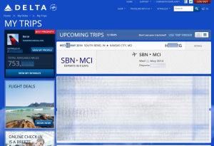
Now one of my BIGGEST pet peeves that would be SOOOOOOOOOOO simple to change. Notice my home page above on Delta. Do you see what is under the bottom? No you don’t. What is it I have all those red arrows pointing at?
Oh, it is the advisory warning about weather or whatever I REALLY need to know about but it is often covered up or hard to get to. Why not move it like I have shown to the top in RED where I can see it and click it when I need to see it. Hello – McFly – Hello! This is not that hard, right?
So tell me. You like the new changes on Delta.com. What else should they change to make the home page better (and don’t say more award space as we all know that one)! – René
.
Editorial Note: Any opinions, analyses, reviews or recommendations expressed in this article are those of the author’s alone, and have not been reviewed, approved or otherwise endorsed by any card issuer.
➲ Barclaycard Arrival™
World MasterCard®
Earn 2x miles
on All Purchases
. .
Advertiser Disclosure: Eye of the Flyer, a division of Chatterbox Entertainment, Inc., is part of an affiliate sales network and and may earn compensation when a customer clicks on a link, when an application is approved, or when an account is opened. This relationship may impact how and where links appear on this site. This site does not include all financial companies or all available financial offers. Opinions, reviews, analyses & recommendations are the author’s alone, and have not been reviewed, endorsed, or approved by any of these entities. Some links on this page are affiliate or referral links. We may receive a commission or referral bonus for purchases or successful applications made during shopping sessions or signups initiated from clicking those links.


I’ve noticed the iPhone app seems to be caching a lot more data and loads pages a lot faster. Now the only waits are for DB queries, and not data that could be saved locally.
In my itinerary list, I’ve noticed that trips where a schedule change has occurred will show a small red exclamation icon. That has made it easy to see which itineraries have changes all at once.
trying to log in at the teeny weepy bottom of the page in teeny weeny space and letters.. and my phone app died it got stuck in loading circle forever
@dotti – you need a bigger phone 😉
Love the new tweaks, the font was the biggest visual change for me.
@Max – I know right, seems silly but really DOES make it better!