Advertiser Disclosure: Eye of the Flyer, a division of Chatterbox Entertainment, Inc., is part of an affiliate sales network and and may earn compensation when a customer clicks on a link, when an application is approved, or when an account is opened. This relationship may impact how and where links appear on this site. This site does not include all financial companies or all available financial offers. Opinions, reviews, analyses & recommendations are the author’s alone, and have not been reviewed, endorsed, or approved by any of these entities. Some links on this page are affiliate or referral links. We may receive a commission or referral bonus for purchases or successful applications made during shopping sessions or signups initiated from clicking those links. The content on this page is accurate as of the posting date; however, some of the offers mentioned may have expired.
As someone who has been flying other airlines more this year I have come to appreciate, not just the power, but the simplicity and elegance of the Fly Delta App.
Correction – I used to appreciate it.
Now really not so much after the latest update that seems to have been created by someone in marketing with Delta who never ever uses the app to fly the airline. And I am not the only one. There is a long thread about this latest update and users on FlyerTalk have been brutal about the changes. Take a look at a few choice ones
- spongenotbob said: “Horrible UX, extremely buggy, and generally unpleasant to use (all the giant blinking cards when scrolling, all sorts of unexpected, fidgety UI behavior, far too much scroll & click). If I did this at my job I would seriously expect to be looking for a new job next week. Unbelievable.“
Yikes!
- MCO Flyer said: “Ughhh I absolutely hate this update. So many unnecessary clicks/scrolling to view such simple things like viewing the UG list or managing what UGs you requested. Seems like they specifically designed this update for the once a year flyer to simplify all the basics (changing flights/seat assignments) as those options are now in a large tab that take up the entire top of the page while everything else requires scrolling/unnecessary clicks.“
And the thread goes on and on this way with frustrated fliers trying to find ways to work around bugs and other issues (there seems to be a great number of them that need fixing).
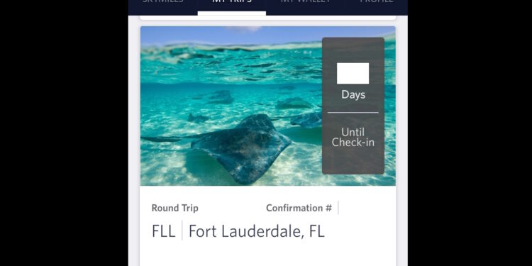
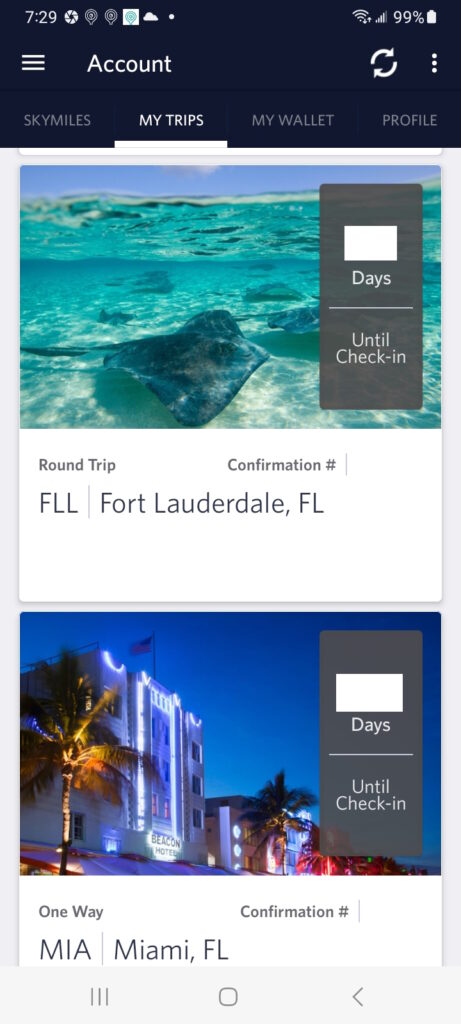
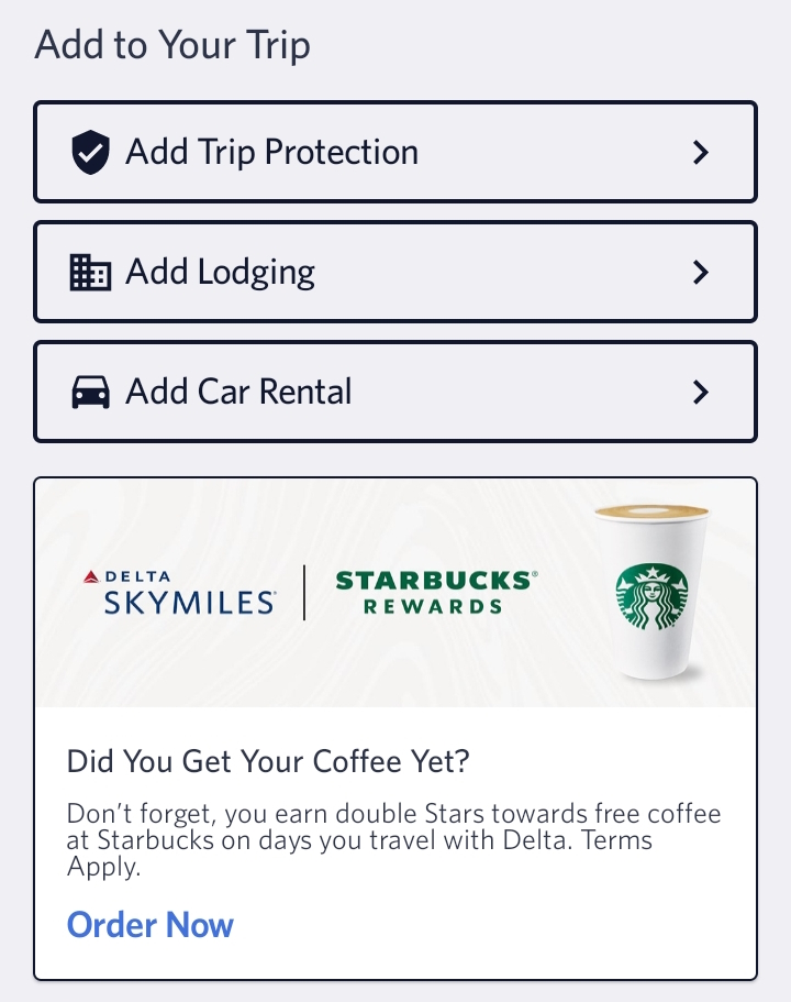
Personally I find the changes just annoying. I do not need large photos of the places I am going (what is up with that) and hate having to click so much more to see data I had instantly presented to me in the past versions. Oh and thanks for the extra advertising in the app, Delta just what I needed to see – grrrrr.
One of the FlyerTalkers is so frustrated they are just logging in to Delta.com via their phones and bypassing the app all together. I tried this but with my limited Delta flights this year not really a fan of this method but if I were flying every week then maybe this would be a solution.
For me as an Android user I simply uninstalled the new App version and reinstalled an older one to bring back the functionality I loved so much in the past. This is not a perfect solution as at some point Delta will stop allowing older builds to keep working.
So now it is your turn. Are you a fan of the updated Fly Delta App now that it has pushed out to all devices or do you hate the updates? Let us, and Delta, know what you think! – René
Advertiser Disclosure: Eye of the Flyer, a division of Chatterbox Entertainment, Inc., is part of an affiliate sales network and and may earn compensation when a customer clicks on a link, when an application is approved, or when an account is opened. This relationship may impact how and where links appear on this site. This site does not include all financial companies or all available financial offers. Opinions, reviews, analyses & recommendations are the author’s alone, and have not been reviewed, endorsed, or approved by any of these entities. Some links on this page are affiliate or referral links. We may receive a commission or referral bonus for purchases or successful applications made during shopping sessions or signups initiated from clicking those links.





Definitely not a fan!
I couldn’t agree more with you. Particularly when the last version of my trips was more than adequate. Now the same functionality requires more taps and is oddly hard to navigate. Hopefully somebody in Delta IT recognizes that it’s ok to go back to the way things were. I see zero upside with the new My Trips.
Not a fan at all. It just keeps getting worse and worse.
Totally read my mind!!! Last week I booked a multi city hop in Europe for Christmas Markets later in the year and was left totally unimpressed and frustrated with the updated app UX. I found some formerly easy, intuitive functions thoroughly “cheesed” over with unnecessary marketing gobbledygook. Tried to use the Book Lodging function and kept getting booted out of the app and could not easily transition from one hotel and/or city without encountering an error. I tried to send our entire itinerary to our son; a previously simple function with the prior version via clearly identified hyperlink; now buried in the ellipsis at the top right of the booking. I tried to send entire booking but could only manage the outbound segment—in one click; could not send the entire itinerary. Interestingly I messaged for assistance in Delta App and the CSR stated “can only assist with adding an unseen trip to app”. When prompted further the CSR was unable to support app function and directed me to dial RES number vs any tech support number. Will use web version vs app for future needs.
Hate the new app. I like to look at my trips in a list as they can be quite close together. These useless images cuts my list to 2 trips. I need to go back to the web.
I agree, the new app is very cumbersome, especially when it was fine prior to the update.
Menu click > submenu click > submenu click > submenu click > submenu click > submenu click > submenu click is The New Simplified User Interface™ for…EVERYTHING EVERYWHERE.
Didn’t you guys know? Lol!
@anon – We are learning sad to say… 🙁
Awful. So much fluff and waste. If you have several trips already booked it takes far too long to scroll. The app was very good…until it wasn’t. Would like the option to revert to previous design.
@Geoff – If on Android you can fyi. You just un-install current one and install one of the older versions.
Geoff = Ios 🙁
Technician issues, I can search to book any flight then all I get it ” were sorry due to technical issues…’. Thats as far as Ibget without uninstalling the reinstalling the app! Been an issue for over a year.
It sucks! Whoever approved this should be fired.
Some low-level manager got a resume enhancement and promotion to a higher level of incompetency. We guests suffer for it.
I hope Ed reads your blog – you are right on with so many of these points with Delta! I’m guessing the new app is also from the same individual who decided to bring back Economy meals, put them on a real plate and call it a “Delta One Meal!”
Delta is taking Bud lights lead. Rather then keeping their loyal customers they are throwing them under the bus. I have only flown 4.3 million on Delta would someone please explain why I should keep flying them. They have gone from bad to terrible. Maybe it’s time to fly whoever has the best fare upfront rather then chase worthless Diamond status
I also hate this update – it’s awful! The biggest annoyance is the stock photos of the cities in my upcoming trips. It makes it very difficult to find a specific trip if you have several in your list. What is wrong with simple and beautiful?? Two thumbs down.
I quite dislike it as well.. too much going on.
The app is cumbersome but it was the only thing that was working for me for a while so I learned to navigate it for what I needed. At one point I couldn’t even log into Delta online (I prefer to do flight shopping via a computer with a screen I can see than on a 6.5″ phone screen) but finally that’s fixed.
But I’m with everyone else that the interface seems clunky and built by people who prefer aesthetics over functionality.
Zero stars. Would not recommend.
I think this “upgrade” really sucks! What used to be easy no longer is because one has to search for the links to find such things as receipts for travel, upgrade status, seat changes. WAY too much blank space so one needs to scroll back and forth and up and down. Even on my phone, the pictures selected for each designation are unnecessary and too large. Just give the destination and dates of travel. Save the pictures for travel brochures.
It is time for DL to actually ask customers about the usability of their site and whether they perceive planned updates are helpful or not. It is obvious that they did not check these changes with any actual customers.
W
What I want to know are 1) who created this useless upgrade and 2) which C-suite executives approved it? Time for them to go.
Ehhhhhh……. They need to be more creative with all those profits they make …..
@Elise – They did not make profits last Q – “Delta posted a net loss of $363 million, or 57 cents per share, citing, in part, a new, four-year pilot contract that includes 34% raises.”
Bring back the OLD ONE!! Why is it taht if something is working just fine..the DELTA IT need to change it and mess it totally up for all of us??????
Meanwhile airfare is very expensive so they r making tons of mulah…..
Yes. Totally agree with this assessment. The app is actually far worse when flying an itinerary that is marketed by Delta but operated by one includes of Delta’s partners. I fly a lot internationally and has been so challenging. I actually gave up on it to be reliable, clear and direct.
I am now working on putting all info on a 3rd party app to make things more direct and straightforward. Wow… what a BIG miss this was for Delta.
Can you give us the link for the older version we can install please?
Nope. We don’t have one.
@Anna – You can Google for sites that have backups of older Android APKs for “Fly Delta” but use at your own risk.
There have several updates recently. Which version is the one that is the problem?
@Sam – The latest one (for Android) that is Fly Delta 5.31.1
I remember the old days of a Delta mobile application on the now-defunct Microsoft mobile operating system. This would have been around 2014 or 2015. It was great because there was a glitch that showed me upgraded into business-class when I had an economy and was flying a route without complimentary elite upgrades. To Delta’s credit, they honored the upgrade every time. Once I had to escalate to the station manager at Tokyo-Narita. This happened to me four or five times before Delta stopped its Microsoft app.
Dislike very much!
Like most things, we will probably get used to it eventually, but there are two things about it that are very annoying, one of them because it’s a change that makes it harder to see what’s happening, and one because they didn’t take the opportunity to fix an obvious omission:
(1) On the flight details, it now shows the actual arrival time without indicating whether it’s delayed or on time.
(2) The “Today” screen still doesn’t show the arrival gate.