Advertiser Disclosure: Eye of the Flyer, a division of Chatterbox Entertainment, Inc., is part of an affiliate sales network and and may earn compensation when a customer clicks on a link, when an application is approved, or when an account is opened. This relationship may impact how and where links appear on this site. This site does not include all financial companies or all available financial offers. Opinions, reviews, analyses & recommendations are the author’s alone, and have not been reviewed, endorsed, or approved by any of these entities. Some links on this page are affiliate or referral links. We may receive a commission or referral bonus for purchases or successful applications made during shopping sessions or signups initiated from clicking those links. The content on this page is accurate as of the posting date; however, some of the offers mentioned may have expired.
You are not seeing things – things look different. Well, not THAT different. I am one of those folks who likes things the “way they are” or at least mostly that way. If you can tweak it and make it better I am all for that. As you can see I/we have loaded in the same theme from over at the DeltaMileageRun page to DeltaPoints. What does this mean and why?
Amazingly more than 40% of you read DeltaPoints on a mobile device. That means the OLD theme that was not responsive just did not cut it anymore. There is no longer any need to pinch things to look around. This theme is responsive. It is also not the final draft, but the rest of the changes will be less major than this one. At some point, rather than a stock theme, DeltaPoints will have a BA in-house built one.
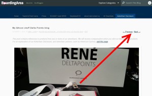
You will, even on desktop, notice some major changes that many have asked for. The first is with photos and page loading. You will notice when you click on a photo it loads full screen AND you have the choice for “previous / next” to be able to quickly flip through the full screen shots. Much better! Plus, the home page should load a TON faster as other than the most current post all the rest are “snippets” that is, you don’t get 15 days worth of posts and photos slowly loading. Also MUCH better.
What is next? There still are many smaller changes on deck. Notice my 747 with vapor trail is gone? It is not gone for good and will come back, but the current theme does not allow it. I made the trade off for now as by year end I think over 50% will read the blog on mobile and waiting longer for the custom theme was not OK.
Let me know what you think so far, knowing it is still a work in progress. Also let me know what device you are using and what browser. That REALLY helps so I can test on other “stuff” – René
Gold Delta SkyMiles®
Credit Card from American Express®
Click HERE for more info
Advertiser Disclosure: Eye of the Flyer, a division of Chatterbox Entertainment, Inc., is part of an affiliate sales network and and may earn compensation when a customer clicks on a link, when an application is approved, or when an account is opened. This relationship may impact how and where links appear on this site. This site does not include all financial companies or all available financial offers. Opinions, reviews, analyses & recommendations are the author’s alone, and have not been reviewed, endorsed, or approved by any of these entities. Some links on this page are affiliate or referral links. We may receive a commission or referral bonus for purchases or successful applications made during shopping sessions or signups initiated from clicking those links.


Looks great Rene! On iPhone running iOS 7.1.2.
@Graydon – txs for input and hardware.
Hooray for RWD! Hopefully the vapor trails can return… maybe you can use something like Adaptive Images, so the images can be done independently of the site template?
Hi Rene, I am using an “ordinary” laptop running Windows and a Firefox browser. So I didn’t “suffer” under the old theme.
Nevertheless, I appreciate your changes. I always liked the way how your DeltaMileageRun blog allowed to browse through the fullsize images of a post.
I also prefer the main page showing only snippets of single posts instead of the full versions.
It looks really good now! Keep up the good work.
Is there an app in the future?
@Kent – one step at a time.
Renee – Your new theme doesn’t work on my iPad using newsify. Whereas before I could read your posts in the Newsify reader (even during takeoff/landing), now all I get is two sentences and a “continue reading” link that can’t be used offline.
While that is annoying, the fact that clicking the continue reading link doesn’t work in the newsify reader’s built-in browser, even if I have a wifi or cellular connection. All that displays is the title of the post. I have to hold down my finger on the link in the newsfeed, and then tell it to open in safari in order to read your posts. I have to *really* want to read what you have to say (based only upon the title and 2 sentences) for it to be worth the effort to click-through.
Gloob
@Bloobnib – correct you must read full stories on the blog not in reader. You can use apps to download off blog.