Advertiser Disclosure: Eye of the Flyer, a division of Chatterbox Entertainment, Inc., is part of an affiliate sales network and and may earn compensation when a customer clicks on a link, when an application is approved, or when an account is opened. This relationship may impact how and where links appear on this site. This site does not include all financial companies or all available financial offers. Opinions, reviews, analyses & recommendations are the author’s alone, and have not been reviewed, endorsed, or approved by any of these entities. Some links on this page are affiliate or referral links. We may receive a commission or referral bonus for purchases or successful applications made during shopping sessions or signups initiated from clicking those links. The content on this page is accurate as of the posting date; however, some of the offers mentioned may have expired.
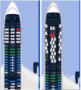
If you have not logged into any of your current reservations on Delta.com, you may want to log in and take a look because they have dramatically updated the seat map as you can see from the photo above.
Personally I am not thrilled with some of the graphic enhancements. For example, the Delta or partial Delta name and logo on the side of the plane may seem like a cute idea but it just clutters up the image. A huge improvement is on planes like the 767-300 (INT bird) you can now see the odd numbered seats that give you the aisle armrest that provides protection from passengers and carts going by in the aisle. Another plus is a more accurate representation of space in exit rows etc 767 (domestic).
Overall I think this is a nice improvement, but it still needs a little more tweaking to be perfect. Delta has really been investing a lot of time and effort as well as working with focus groups to improve the visual appearance of Delta.com and the “My Delta” page. Expect more in the coming months. Do you like the changes? – René
.
Editorial Note: Any opinions, analyses, reviews or recommendations expressed in this article are those of the author’s alone, and have not been reviewed, approved or otherwise endorsed by any card issuer.
➲ Barclaycard Arrival+™
World MasterCard®
Earn 2x miles on All Purchases
. .
Advertiser Disclosure: Eye of the Flyer, a division of Chatterbox Entertainment, Inc., is part of an affiliate sales network and and may earn compensation when a customer clicks on a link, when an application is approved, or when an account is opened. This relationship may impact how and where links appear on this site. This site does not include all financial companies or all available financial offers. Opinions, reviews, analyses & recommendations are the author’s alone, and have not been reviewed, endorsed, or approved by any of these entities. Some links on this page are affiliate or referral links. We may receive a commission or referral bonus for purchases or successful applications made during shopping sessions or signups initiated from clicking those links.


You probably meant to say that on the B767-300ER you can see the aisle arm rest, not on the A330 where all the window seats are the same.
@M – I did. will fix. Txs.
What further improvements do you think that you could make? You didn’t give any other examples of things that you didn’t like except the logo (which is trivial IMO).
@George – they have made two or three changes just in the last few weeks that I have already blogged about (just did not link back to the old posts). There are more on the way I just can not talk about them yet. 🙂
It doesn’t work on Safari. I don’t see the plane, only seats flying in air (which would be terrifying whichever seat you pick 🙂
I like it overall though (when I looked in other browsers). More realistic space representation is definitely useful
Took a look at a few of my upcoming trips and I my liked the new picture, in the previous pictures of the seats/planes the view of the seats and rows were almost always straight across, now I noticed that seats were offset in some sections. Also picked up on the size and location of the engines, never really paid attention before but sure makes a difference in the air.
I am not an expert on each type of aircraft as some are , so this is a better way to really know what you are selecting without going to Seatguru.
To my eye, the scale, size and spacing of the seats and the plane as drawn is now more realistic… so overall good new look!
I’d rather delta spend their time and talent on fixing the award calendar.
Christine beat me to it. This is just more lipstick on the pig instead of fixing known defects.
I don’t like the change. On flight 284 BKK-LAX, I only see one seat map for the whole flight even though there is a plane change in NRT and a seat change as well. This does not happen on the phone app.