Advertiser Disclosure: Eye of the Flyer, a division of Chatterbox Entertainment, Inc., is part of an affiliate sales network and and may earn compensation when a customer clicks on a link, when an application is approved, or when an account is opened. This relationship may impact how and where links appear on this site. This site does not include all financial companies or all available financial offers. Opinions, reviews, analyses & recommendations are the author’s alone, and have not been reviewed, endorsed, or approved by any of these entities. Some links on this page are affiliate or referral links. We may receive a commission or referral bonus for purchases or successful applications made during shopping sessions or signups initiated from clicking those links. The content on this page is accurate as of the posting date; however, some of the offers mentioned may have expired.
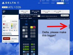
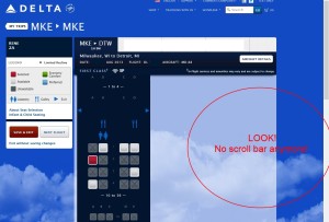
I want to thank Delta for fixing one of the most annoying things on Delta.com (yeah I know there are still a few more to fix). But the one I talked about HERE affects me a ton as I follow my own advice from the morning’s Rookie post and check my seats often.
If you have checked your seats lately, the tiny bar is not just better but completely GONE! I think this is a great improvement as the bar was a bit redundant anyway. Now all we have to do is scroll up and down the page and the airplane seat map moves along with us.
We do tend to be maybe a little bit hard on Delta “IT” (and deservedly so due to the award engine) but this was a good change and I thank Delta IT for making my daily Delta.com experience just a little better (do you think they could make the Skyclubs free taps pour our non #SkunyGate beer? 🙂 ) – René
▲Delta▲ SkyMiles® Credit Card
RESERVE/PLATINUM/GOLD
from American Express®
Click here for more information
.
.
Advertiser Disclosure: Eye of the Flyer, a division of Chatterbox Entertainment, Inc., is part of an affiliate sales network and and may earn compensation when a customer clicks on a link, when an application is approved, or when an account is opened. This relationship may impact how and where links appear on this site. This site does not include all financial companies or all available financial offers. Opinions, reviews, analyses & recommendations are the author’s alone, and have not been reviewed, endorsed, or approved by any of these entities. Some links on this page are affiliate or referral links. We may receive a commission or referral bonus for purchases or successful applications made during shopping sessions or signups initiated from clicking those links.


the arrow to scroll through months while choosing arrival and departure dates is absurdly small and almost impossible to click more than a few times before missing it which closes the window and makes you start over. Woe to those who plan travel out of your current month.
Stop making excuses for them, it’s 2014. Test your [edit] website with people who actually use it and then release it.
Now, hopefully they can get to working on the booking engine…
Clearly the IT staff doesn’t actually use the product. There’s no reason it should take months to fix something as simple as this.
I have another great new feature of the borderline useless mobile app (Android version): The mobile app upgrade list and Delta.com don’t match. I haven’t seen this one before. The mobile app is telling me I’m #7, but the Delta.com app is telling me I’m #12. I’m assuming delta.com is probably correct, so what this means is that even if you can actually get the mobile app to load, the data is likely bad.