Advertiser Disclosure: Eye of the Flyer, a division of Chatterbox Entertainment, Inc., is part of an affiliate sales network and and may earn compensation when a customer clicks on a link, when an application is approved, or when an account is opened. This relationship may impact how and where links appear on this site. This site does not include all financial companies or all available financial offers. Opinions, reviews, analyses & recommendations are the author’s alone, and have not been reviewed, endorsed, or approved by any of these entities. Some links on this page are affiliate or referral links. We may receive a commission or referral bonus for purchases or successful applications made during shopping sessions or signups initiated from clicking those links. The content on this page is accurate as of the posting date; however, some of the offers mentioned may have expired.
If you have not looked for a flight yet today on Delta you are in for a change. We have been getting lots of warnings that Delta will be doing “IT” tweaks and upgrades over the past few weekends, and this appears to be one of them.
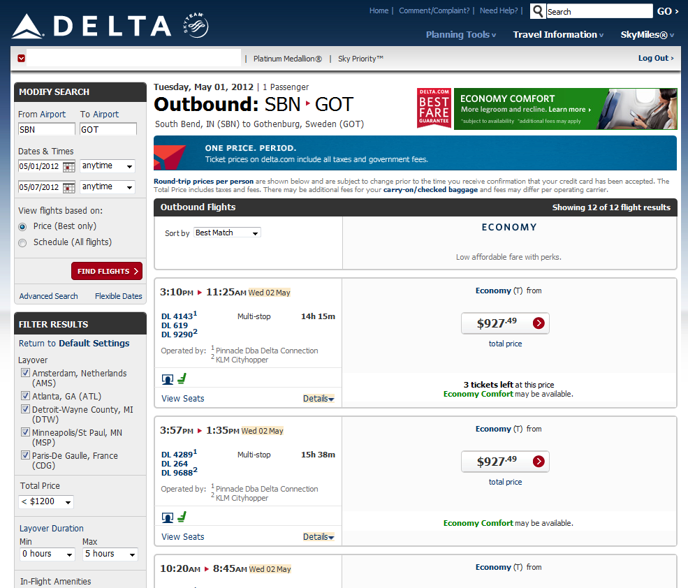
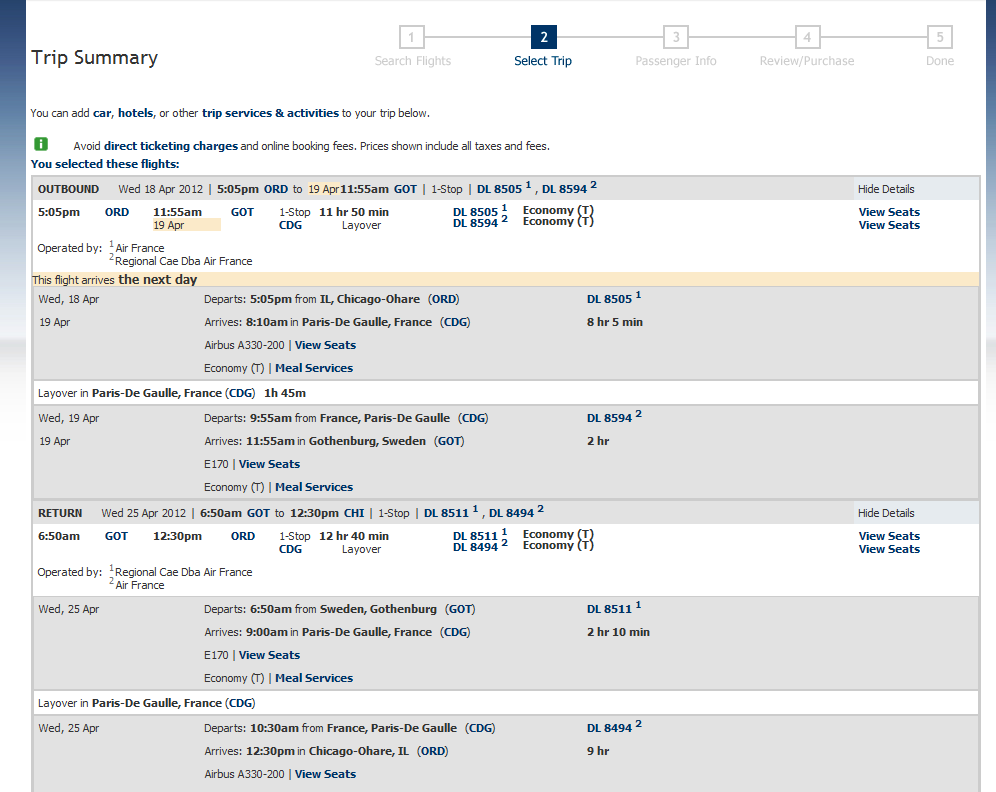
At first look I like how they have put a lot of information on the same page with drop downs that in the past you often did not see easily, so this is a big plus. The old way you had to get to the next to last screen trip summary to get this much data in the same way.
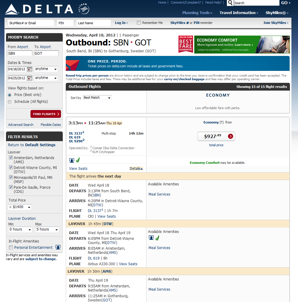
But Delta has also removed a TON of valuable information we need to see. You can still see the old way info was displayed by clicking the “by schedule” button, but then you don’t know the price of the itinerary you are picking until later on.
By removing the connection time on the first page you may miss that you only have say 31 min in ATL. And while technically a “legal” connection, this is not practical and will often times result in a missed flight! And there is more. If you do a search from ALL Chicago area airports you will not know what airport is picked for you (ORD or MDW) until you hover your mouse over the flight number whereas the old way you could see it right away. Also some things are “hover-able” for info and other things, like meals, are click and a pop up takes you to other parts of Delta.com
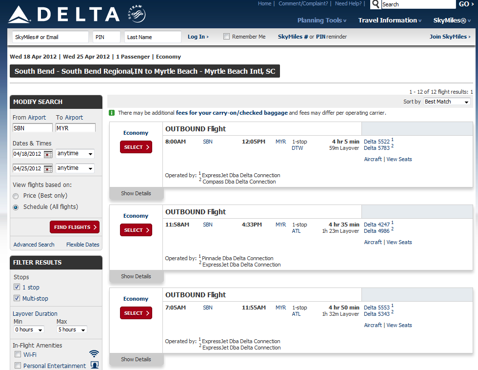
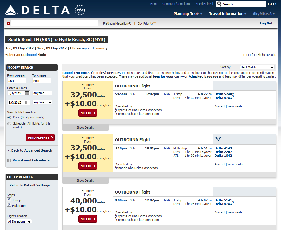
Skymiles tickets searches have not yet received the new upgraded look yet and look as they did before:
I think there is still room for improvement and tweaks. I do like some of the changes but I think going “clean” has resulted in too much important data not displayed. So what do you think? Do you like the new look? Like the direction so far? Better the old way? – Rene
▲Delta▲ SkyMiles® Credit Card
American Express – RESERVE/PLATINUM/GOLD
Click here for more information
![]()
Advertiser Disclosure: Eye of the Flyer, a division of Chatterbox Entertainment, Inc., is part of an affiliate sales network and and may earn compensation when a customer clicks on a link, when an application is approved, or when an account is opened. This relationship may impact how and where links appear on this site. This site does not include all financial companies or all available financial offers. Opinions, reviews, analyses & recommendations are the author’s alone, and have not been reviewed, endorsed, or approved by any of these entities. Some links on this page are affiliate or referral links. We may receive a commission or referral bonus for purchases or successful applications made during shopping sessions or signups initiated from clicking those links.


Hi Rene, a bit off-topic but I was trying to find an email for you to send you a DL promo-related question. Sorry to clutter up the comments thread with this.
Hi Aleks – no prob, it is in the About Me tab. rene@deltapoints.com