Advertiser Disclosure: Eye of the Flyer, a division of Chatterbox Entertainment, Inc., is part of an affiliate sales network and and may earn compensation when a customer clicks on a link, when an application is approved, or when an account is opened. This relationship may impact how and where links appear on this site. This site does not include all financial companies or all available financial offers. Opinions, reviews, analyses & recommendations are the author’s alone, and have not been reviewed, endorsed, or approved by any of these entities. Some links on this page are affiliate or referral links. We may receive a commission or referral bonus for purchases or successful applications made during shopping sessions or signups initiated from clicking those links. The content on this page is accurate as of the posting date; however, some of the offers mentioned may have expired.
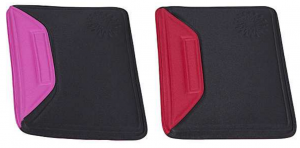
It is amazing just how many read the blog on an iPad or HP Touchpad. Do you just toss it in your luggage when you travel? Do so no more. I have a new RED and PINK Nuo Sleeve to give-a-way today!
Winner number ONE gets to pick first. Winner number TWO gets the other color! Here is how you enter. You must comment below and tell me correctly [edit: ok any guess counts] what is different on the blog to qualify.
This should be fun -René
American Express Premier Rewards
Gold Card – 25,000 points
Click here for more information
Advertiser Disclosure: Eye of the Flyer, a division of Chatterbox Entertainment, Inc., is part of an affiliate sales network and and may earn compensation when a customer clicks on a link, when an application is approved, or when an account is opened. This relationship may impact how and where links appear on this site. This site does not include all financial companies or all available financial offers. Opinions, reviews, analyses & recommendations are the author’s alone, and have not been reviewed, endorsed, or approved by any of these entities. Some links on this page are affiliate or referral links. We may receive a commission or referral bonus for purchases or successful applications made during shopping sessions or signups initiated from clicking those links.


The biggest change on the blog I have seen is that you changed the header image to the jet and waving flag logo. Im not sure but I also think that facebook icon at the top that doesn’t do anything is new too. 😉
Is that a new banner graphic for the site?
Same observation: the banner on top changed
New banner, but I liked the old one better.
the airplane logo…
It’s the banner.
The headline banner.
@ all – nope, @ Zach – facebook icon ? I’m not on facebook? where do you see an icon? 🙂
You added a place with contrails at the top
Español amigo! 😉
Logo
new banner…747 retired
Good job LCA – I think it’s the Espanol Button as well!
Your headline banner changed
Banner….
Espanol
Header banner
New banner but I like the old one better!
The header at the top of the screen
I have no idea. I just started following yesterday!
The new banner made by 99designs. 🙂 see I read!
I didn’t even realize the blog was available in Spanish so I’ll guess that as well.
Banner and logo
The new banner. Thanks for the contest.
the banner!!!
The Espanol link at the top.
@deltagoldflyer Ill show you,its weird.
the banner image has changed
New banner at the top!
The banner!
banner
The banner used to be a Boeing 747 series aircraft.
@Harold – I still have a 747 it is just smaller – 😉 … but that is not it….
It’s the banner 🙂
nice new logo!!!
The banner is new.
New Banner at top of page
New banner!
the banner on top changed
I’ll guess that it’s a new aircraft as well.
The header.
The header image is different! And possibly some other things I’ve never paid attention to, but I can’t handle change! Hold me, I’m scared.
You updated the best points card link???
Contrails! love my iPad.
besides the banner?
The plane is cutting through the header now instead of below it.
banner
banner?
The banner has changed.
@all it is not the banner ( all comments count however ).
font on the logo
Spanish!
New banner across top
BTW all, not going to post about it, but as others are telling you the days of the Chase Continental card are almost over we have been told. I have a link up in my Best Point Cards if you want more info. – Rene
Spanish? I usually read the blog in my RSS feed so I don’t typically see changes.
Red -> white on banner?
The banner?
The banner with the great new logo.
Header banner is new.
Banner!
The “Espanol” link at the top?
@ LGA @ Ozzie and a few others – bingo! but all will have a chance to win soon – Rene
Espanol! (Cool)
The added Spanish option is new.
New banner graphic – I like it!
The banner
The banner.
The banner/ logo. And, a robust list of categories and resources on the right side.