Advertiser Disclosure: Eye of the Flyer, a division of Chatterbox Entertainment, Inc., is part of an affiliate sales network and and may earn compensation when a customer clicks on a link, when an application is approved, or when an account is opened. This relationship may impact how and where links appear on this site. This site does not include all financial companies or all available financial offers. Opinions, reviews, analyses & recommendations are the author’s alone, and have not been reviewed, endorsed, or approved by any of these entities. Some links on this page are affiliate or referral links. We may receive a commission or referral bonus for purchases or successful applications made during shopping sessions or signups initiated from clicking those links. The content on this page is accurate as of the posting date; however, some of the offers mentioned may have expired.
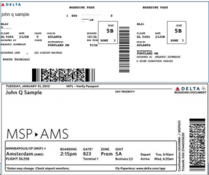
I was not even going to talk about this. I was mildly surprised when the new BP was handed to me the first time recently. Like most things in my life, I like things “the way they are”. When I get used to something it can be hard to change. But if it is better, I am all for it. On FT and at the Delta Blog and in the press they are talking about this so now it is my turn.
So is the new pass better? I mean we all have our own opinions as to what looks best. Just look at my fun with the new DeltaPoints.com logo. Some love it, some like others better. So there is no making everyone happy.
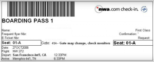
[EDIT: from reader comments about old NWA pass it looked like this]
I do like the fact that soon you will be able to have multiple flights all on one boarding pass. That will be a big plus. They prominently put the gate and terminal in the middle of the pass, but I will trust my phone app as they change all the time so the usefulness is minimal to me plus on my last flight they were just a dash on my BP. In the old one you always could find your seat and that is one of the most important things for you and it is not as prominent on the new one.
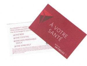
They do now hide your skymiles number but still show full name, confirmation number and ticket number. Is this too much info? So let your fellow blog readers know. You tell me what you think. Is it better? Like the old one better? Step in the right direction but needs work? Let us know. I will do the random.org thing and give away a set of drink coupons if you tell us! – Rene
▲Delta▲ SkyMiles® Credit Card
American Express – RESERVE/PLATINUM/GOLD
Click here for more information
Advertiser Disclosure: Eye of the Flyer, a division of Chatterbox Entertainment, Inc., is part of an affiliate sales network and and may earn compensation when a customer clicks on a link, when an application is approved, or when an account is opened. This relationship may impact how and where links appear on this site. This site does not include all financial companies or all available financial offers. Opinions, reviews, analyses & recommendations are the author’s alone, and have not been reviewed, endorsed, or approved by any of these entities. Some links on this page are affiliate or referral links. We may receive a commission or referral bonus for purchases or successful applications made during shopping sessions or signups initiated from clicking those links.


I hate change – just when you get comfortable and used to something they make it different & by the time you get used to the new format it changes again. I agree with using the phone app since gate changes happen all the time.
Thanks for the drinks!
Really just reminds me of the old nwa boarding pass which is WAY better because multiple legs can be placed on a single boarding pass! One of my biggest hiccups with the Delta/nwa merger was the switch to deltas archaic system! So this is better!
Haven’t seen the new one in person yet, but the pics look pretty good. Will have one in hand next friday!
The inclusion of multiple flights gives the new version an advantage.
Having all your boarding passes in one place sounds good to me!
I like the change, it seems like progress.
The new style is quite user-friendly. I appreciated this when putting mom on a flight last week!
I think it’s an improvement
Old format!
I like the idea of multiple flights on one BP – less paper is better. Not to make it too complex, but perhaps they could use a QR code on the pass to integrate with the mobile app to quickly pull info of one sort or another up. Just thinking out loud.
Seriously, the amount of effort Delta invests in something useless like the design of their boarding pass is ridiculous. Spend the effort elsewhere!
It’s all nice and good, but I wish they’d go the route of Virgin America and print on a smaller, more durable piece of paper. Now that would be a useful improvement!
I like new format
I do not like the obscured SkyMiles number as use that when logging into SkyClub wireless access points as I don’t commit my number to memory.
The new boarding pass seems sharper and cleaner.
I like everything except that Delta still has trouble handling middle names. Now my middle name is at least not attached to my first name, but they still cannot manage to capitalize the first letter and now cut of my Andrew as “and,” I have already started getting cracks from TSA agents, “Is your middle name really Andrew?” This will get old fast.
Use the mobile passes now anyway where possible so almost a moot point.
I honestly don’t notice changes like these. I guess I rely to much on my phone’s Delta app. Also, I miss the old card stock boarding passes….they made great book marks! LOL
@Gussomer – what are book marks for? How do you get one into you e-reader? 😉 ( had to go there since you are talking phone app!)
I like the new format and the important info is laid out in a logical order of what you need to know (flight, boarding time, gate, zone, seat). I still would like to see my SkyMiles # on it since that makes me feel all warm ‘n fuzzy that I’m getting credit for the trip. I don’t have a problem with it or the conf/ticket # showing. I need those if I ever need to reference it to DL or prove I took the flight.
Like multiple flights on one pass. When wife and I travel we often have two connections. This will help.
At the very least, it is much more visually appealing, less cluttered, and uses white space more wisely.
Overall I like the new format. All of my trips are multi-segments and having the flight cities featured prominently makes it easier to make sure I have the right one. I do agree about not having the seating featured more prominently, maybe one size bigger and in bold would be better.
I look forward to the possiblity of having multiple flights on 1 pass, less things to get lost in my bag.
I guess I didn’t realize that I really liked the old NWA boarding pass. But if the new one speeds up the boarding process, then I am all for it.
I like the new format but would also love the seat assignment to be bigger. It really isn’t a huge deal to me either, since most of my flights leave from MCO or PBI, so I can use my iPhone!
Interesting to note that some Delta stations haven’t switched. Don’t know if it’s a regional decision or what, but I flew out of Montgomery this week and still had the old format.
I like the new look. It is much cleaner. However, it could go further in keeping personal information personal.
I like the new look. Whatever gets us on the plane faster works for me.
I shouldn’t go into too much detail….BUT there are groups of Delta frequent fliers who are asked regularly about all SORTS of travel related issues… The new boarding pass was sent out to them a few months ago for feedback and comments. So Delta did get “real world” input…they didn’t just come up with this on their own in a vacuum…
i got this new one yesterday and was surprised by it. it took me a bit to find my seat, but overall i like that it looks cleaner with no duplicate info. it will just take some getting used to.
Makes keeping track of all segments easier esp on crazy mileage runs
I flew DUB-ATL-LGA on monday. I still had two boarding passes. It didn’t seem very new or exciting -maybe a new font.
What pleased me more was the US prescreening at Dublin, so I didn’t have to go through passport control at ATL.
It will take some getting used to, but I think it looks a lot cleaner than the previous ones.